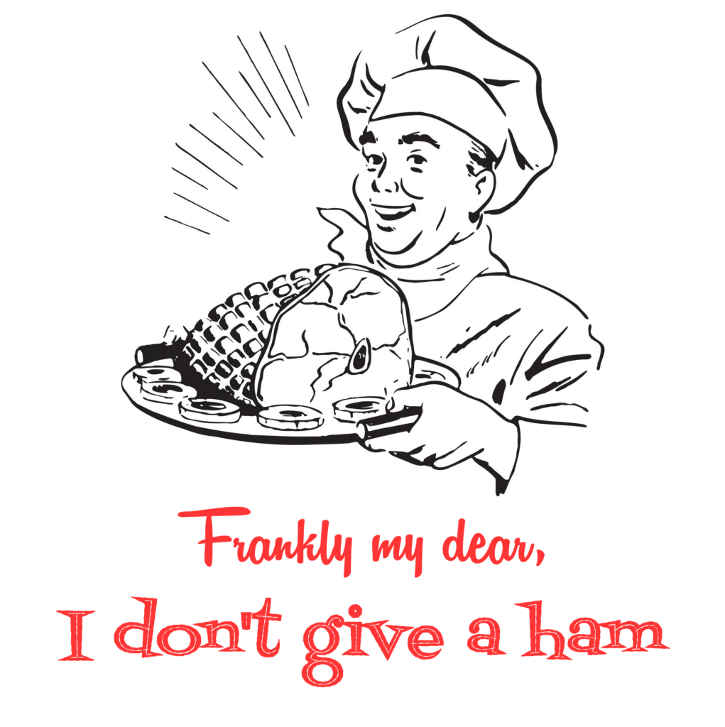
This was another one of those silly ideas that just came to mind and I couldn’t let go. For some unknown reason, the actual phrase “…don’t give a damn” wasn’t even the first step in this idea. The full quote “Frankly my dear, I don’t give a ham” came to me all at once. And once it did, I knew what kind of design this must be.
I can’t take credit for all of this design, though. After a few minutes of googling, I found the exact retro image that I was looking for: the guy holding the ham plate (courtesy of alamy.com). It was perfect.
After pulling that into GIMP, I just needed to figure out the right font(s) to use for the text. I researched it and found the two fifties-esque fonts that I was picturing in my head: Remachine Script for the top and Fontdinerdotcom Jazz for the bottom. Finally, I just tweaked the color of the text to be one that I associated with the midcentury-modern vibe and poof! Done!


